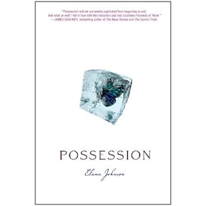
You remember these covers, right?:


Gorgeous, right? Well here's what landed in my inbox from Elana...
First, I present the newly-designed cover for the POSSESSION paperback:

I love (and own) the original cover in hardback, but I think the graduated background colour really compliments the the butterfly in the ice. And did you notice the new tagline?
And here is the hardback cover for SURRENDER:
Again, I think the colour of the background makes the bird in the jar pop.
I'm normally a bit on the fence about cover redesigns. I like my books (especially the ones in a series) to compliment each other when they live on my bookshelves (I know, I'm weird *grins*). But I do love these new covers. Plus the cover backgrounds just happen to be two of my favourite covers. :)
What about you? What do you think about the POSSESSION and SURRENDER covers?


3 comments:
I do think the colored, graded backgrounds make the object stand out more, which I like, but now I wonder what will happen with the surrender paperback. Interesting.
I like the blue background much better.
Lovely!! I loved the hardcover white texture, but you're right the graduated colors are neat!
Post a Comment